Creating a reference guide
Reference or ID guides are a great way to extend the usefulness of your projects. They have been designed to help you to provide key reference information to field workers who are responsible for data collection. They are also perfectly suited to providing field guides in projects that are tailored towards citizen science data collection.
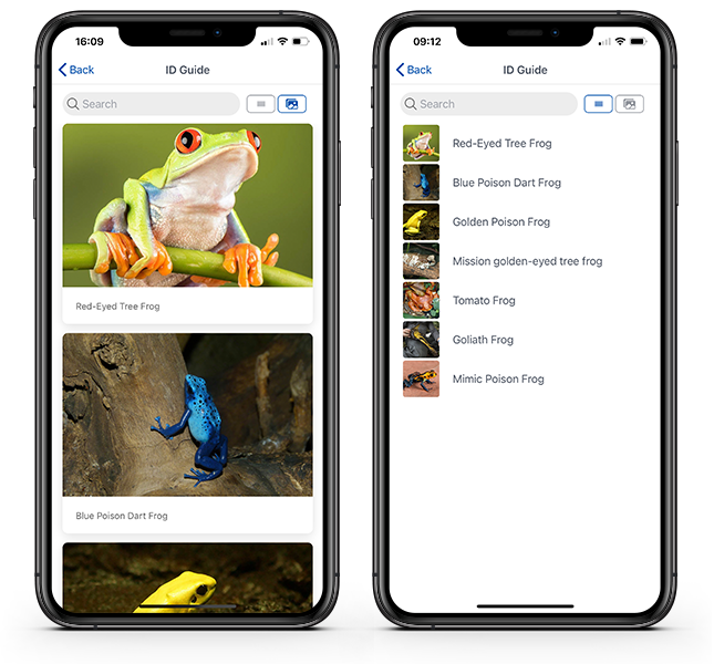
Reference guides in Coreo will look like one of the images shown below, depending on whether you have Card (image on left) or List view (image on right) selected:

Thankfully, creating a reference guide with Coreo is very straightforward. The most time consuming part of the process will be researching and putting together all of the information, such as the images and text. For the purposes of this workshop, we’ve provided all the data you need. There are 2 simple steps to creating a reference guide:
Stage 1 – Preparation
- Create a .csv file of your reference guide data – we’ve done this bit for you.
- Import your collection. You did that in the previous section Creating a collection.
- Import all of the media assets required for your guide. As above, you did this in the previous section.
Stage 2 – Create the reference guide using a template
- This step simply involves selecting a template in the page builder and then specifying what you want the guide to show.
Okay, let’s get started.
- Return to Configuration and then Pages.
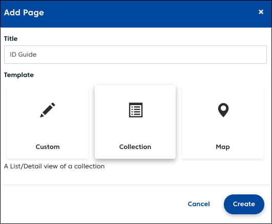
- Select the Add Page button
- Give the new page an appropriate title and choose the Collection template.

- Once you done that, click the [Create] button
- You should now see your newly created page in the Pages window
- Click on it to complete setting it up
- Select the options shown in the image below:

Here’s an explanation of the numbered features in that window:
- Collection – Choose the collection that you want to use to build your reference guide
- Default layout – Choose whether your reference guide shows large card images, or smaller thumbnails in a list-style view. This is simply the default setting for the guide and users can switch between the two types within the project.
- Show image gallery – Do you want your reference guide to show any images that are associated with the collection items? These will be displayed as a carousel gallery at the top of each item’s details page in the guide (see number 3 section of image below).
- Show audio gallery – If any of your reference guide items have audio files associated with them then these will be incorporated into the guide. Audio clips are displayed at the bottom of an item’s details page (see number 4 section of image below for an example).
- Select attributes to display – Each collection will have a number of attributes which will be selectable here. In this example we have two: ‘Scientific’ and ‘Description’. If selected, these attributes will be added into each item’s details page providing us with the species’ scientific name and description text (see number 5 section of image below).

Final checklist of things to do:
- Change the page’s icon to something appropriate (in the Page Settings column)
- Check the box to make the page visible
- Make sure the box is checked to enable the page to appear in navigation
- Now Save the page
Checking your reference guide
Your reference guide should appear dynamically in the side panel. This is interactive and you can explore and check your reference guide before completing this exercise.